A Booking,
Start to Confirmed
Booking Sequence
& Glass UI
Three Moments,
Already Written
The assignment was to animate a short product sequence telling the story of a booking arriving and being confirmed. The supplied lifestyle footage had to carry the scene rather than the UI sitting on a flat background — a premium, fast, satisfying piece of brand storytelling.
Everything arrived ready: a storyboard with exportable UI screens, the lifestyle footage, brand typography and an optional glass-effect template. Nothing had to be invented — which moved the whole brief onto execution, pacing and craft.
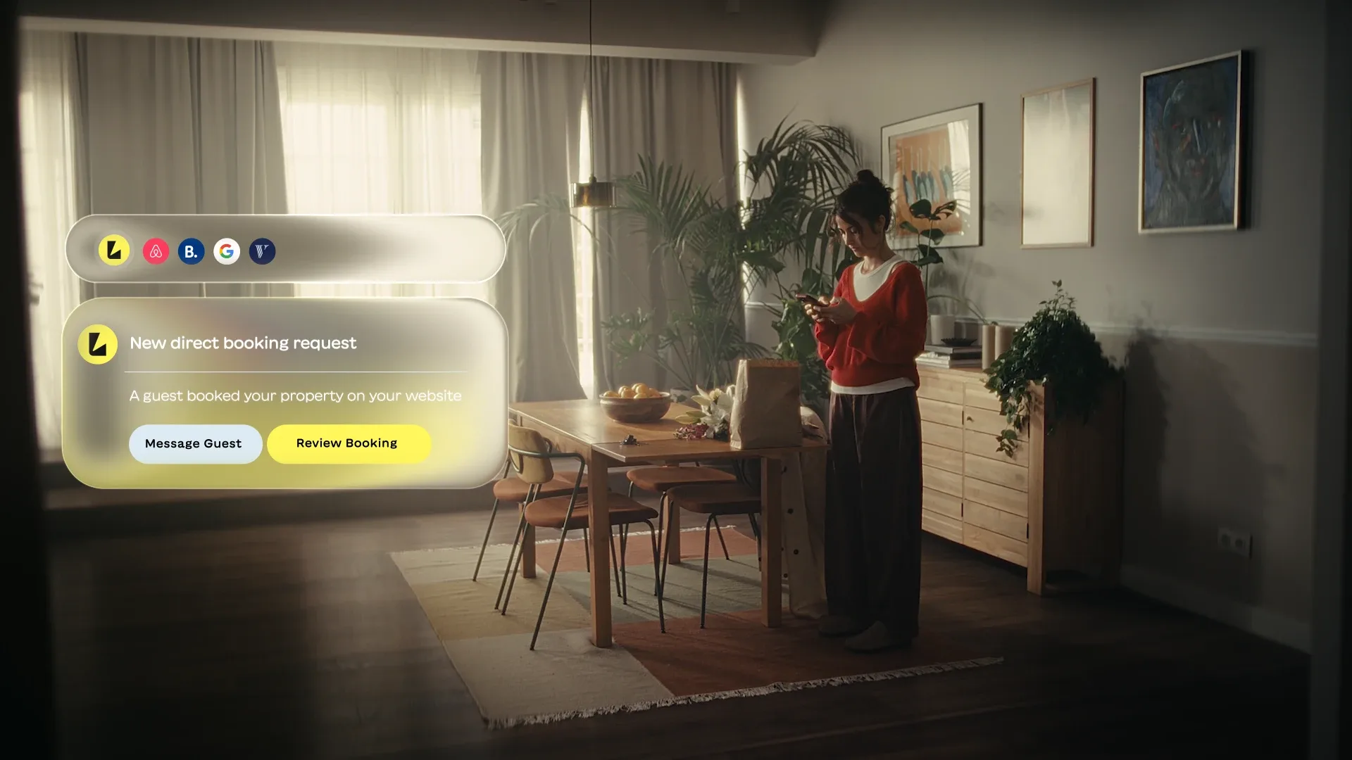
- 01The booking arrives
A direct booking notification lands, and the Review Booking call to action is pressed.
- 02Reviewed and accepted
The booking is previewed with guest, nights, price and dates, then accepted.
- 03The calendar fills in
The unified calendar expands and the new booking takes its place among the others.
- 04The logo animation
The sequence hands off to the brand logo animation to close.
Breaking a Linear
Story Apart
The supplied TVC footage told one straight story: a woman walks into the house, moves through her chores, leaves. Cut in that order it would have run out long before the sequence did.
So I stopped treating it as a timeline. Shots are reversed to extend them, retimed to sit under a panel build, and reordered to put the right body language beneath the right beat. The last shot before the logo is played backwards, so she appears to set the phone down rather than pick it up — the booking is handled, and she is done.
Rebuilt to be Animated
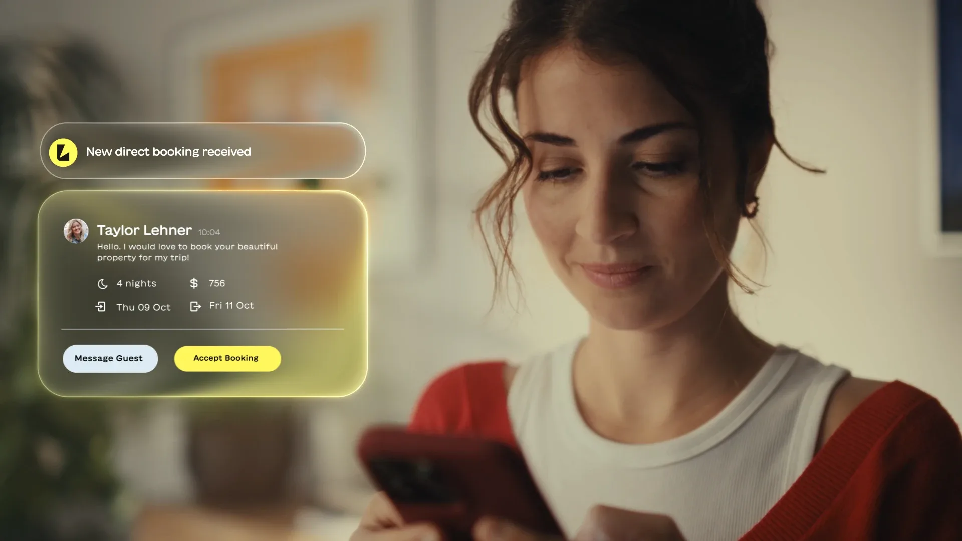
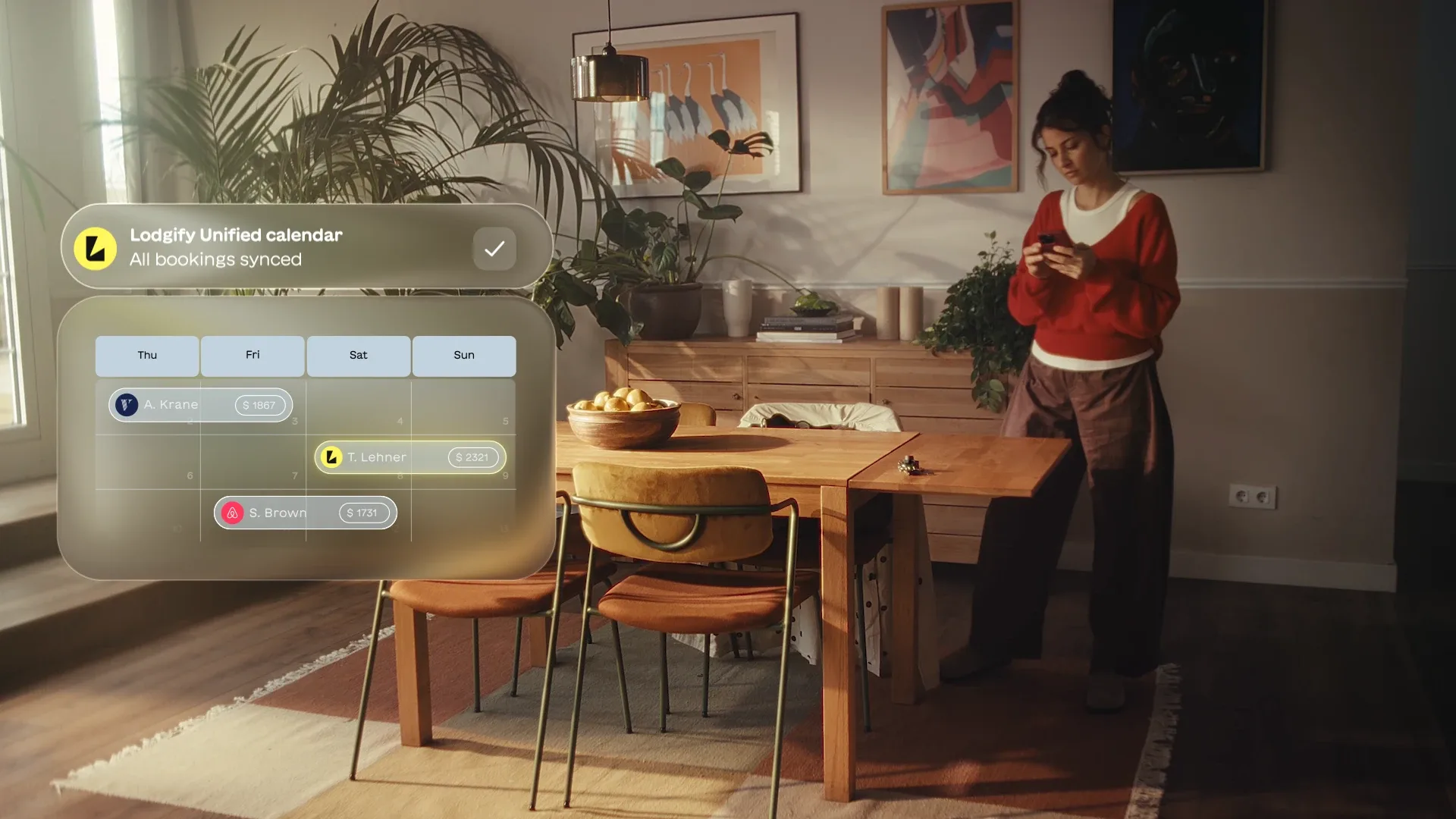
A flat UI export animates as one flat thing. Rebuilt, every row can arrive on its own.
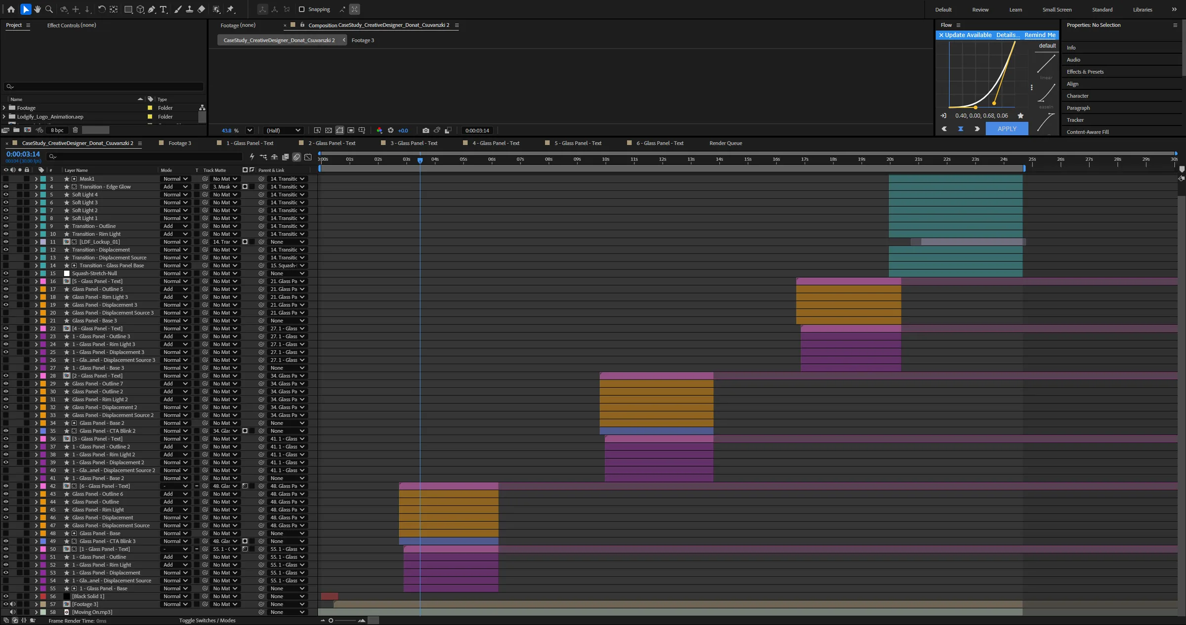
I reconstructed the UI frames in Figma from the supplied screens, then exported them as separated pieces and rebuilt the panels in After Effects. Avatars, titles, the nights and price rows, the dividing rule and each call to action became their own layers, so the card could assemble in order instead of fading in whole.
The calendar works the same way: the grid, the day headers and each existing booking are separate, so the panel can expand and the new reservation can drop into its own row with the others already settled around it. DecomposeText handled the type breakdowns and Flow kept the easing consistent across every build.
Building the
Panel Myself
A glass-effect template came with the brief, but I built my own panel so the look stayed mine and stayed adjustable. Each panel is a stack: a base, an outline, a rim light, and a displacement pass driven by its own source layer, so the footage behind actually bends through the card rather than sitting flat behind a blur. Deep Glow carries the yellow spill off the call to action.
Every panel repeats that stack, parented to a squash-and-stretch null so the card can arrive with weight. Rift kept the staggered offsets manageable once the comp ran to roughly sixty layers.
Landing on the Logo
The brief ended on the brand logo animation. I ran the transition into it off the same glass language — an edge glow, a displacement sweep and soft lights carrying the last panel off — so the hand-off into the wordmark belongs to the piece rather than being stapled onto the end.
Sound was optional and I treated it as part of the work. I cut a simple sound design pass in Premiere Pro with Artlist effects, letting the ticks and whooshes land on the panel builds so the pacing reads as deliberate.
Pushing Given
Assets Further
With the story and the screens already decided, the interesting part was how far the supplied material could be pushed. Reversing and retiming the footage, and building the glass rather than using the template, turned a fixed set of assets into something with its own rhythm.
With more time I would tighten the middle beat, where the booking card holds a little longer than it needs to, and design the sound against the animation from the start rather than cutting it once the picture was locked.
Interview assignment based on supplied Lodgify brand assets.