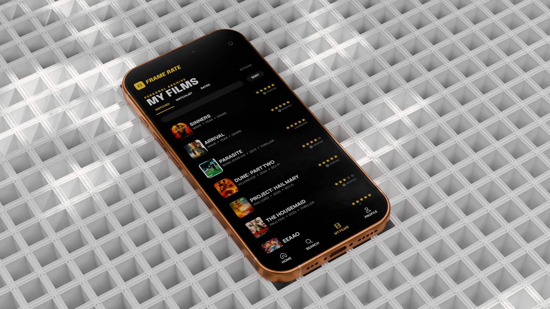
A Movie Rating
App Built Around
Trust
Frame Rate is an iOS app concept designed to fix what's broken about how we rate and discover films. Every decision — what you see, when you see it, and whose opinion counts — is built around reducing bias and surfacing what actually matters to you.
Created entirely solo — UX research, user flows, wireframes, high-fidelity UI, motion design, sound design, and AI voiceover. The 3D phone, scene, lighting, and camera work were modeled and rendered in Blender, with final animation assembled in After Effects.
The Problem
Oversimplification
A single score collapses hundreds of different opinions into one number. A film that cinephiles love and casual viewers find slow gets the same 3.8 as a film everyone agrees is just okay.
Anchoring Bias
When you see a score before forming your own opinion, that number anchors your perception. Early reviews disproportionately shape the final average — users rate films closer to the existing score than they would have rated them blind.
No Verification Layer
There is no way to know whether a reviewer actually watched the film. A review written after a trailer and one written after two viewings carry identical weight on every major platform.
Lack of Personalization
A global average reflects the average viewer — not you. If you consistently rate a specific type of film 0.8 points higher than the community, the global score is systematically misleading for your taste profile.
36 People.
4 Clear
Patterns.
Competitive analysis of IMDb, Rotten Tomatoes, and Letterboxd revealed recurring structural failures: no reviewer transparency, ads disrupting the experience, and overly blunt scoring systems.
21 of 36 respondents had ignored a rating after their experience contradicted it. 16 had chosen something purely because of a high score — and later regretted it. These findings shaped one principle: protect your first impression before giving you anyone else's.
Four Ideas.
None Exist Together.
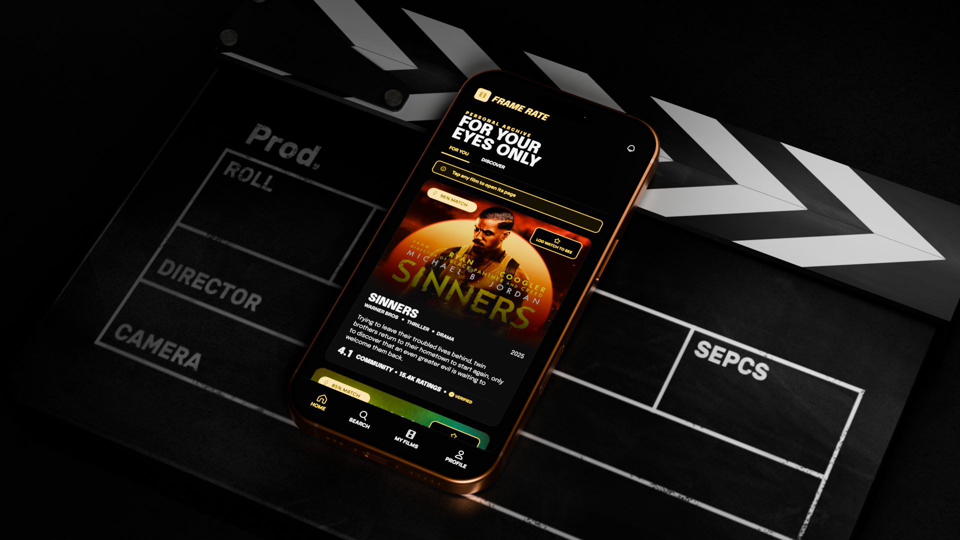
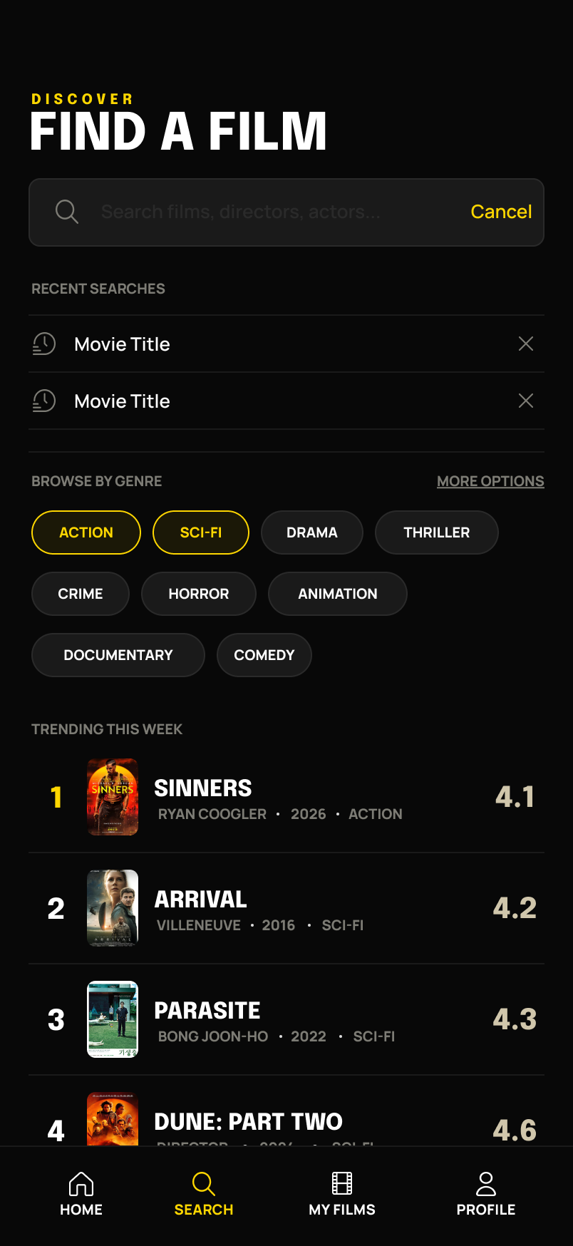
Seen-it Gating
Scores are hidden until you log a watch. Your personalized taste score is locked until you've seen the film — eliminating anchoring bias at the structural level, not through a disclaimer.
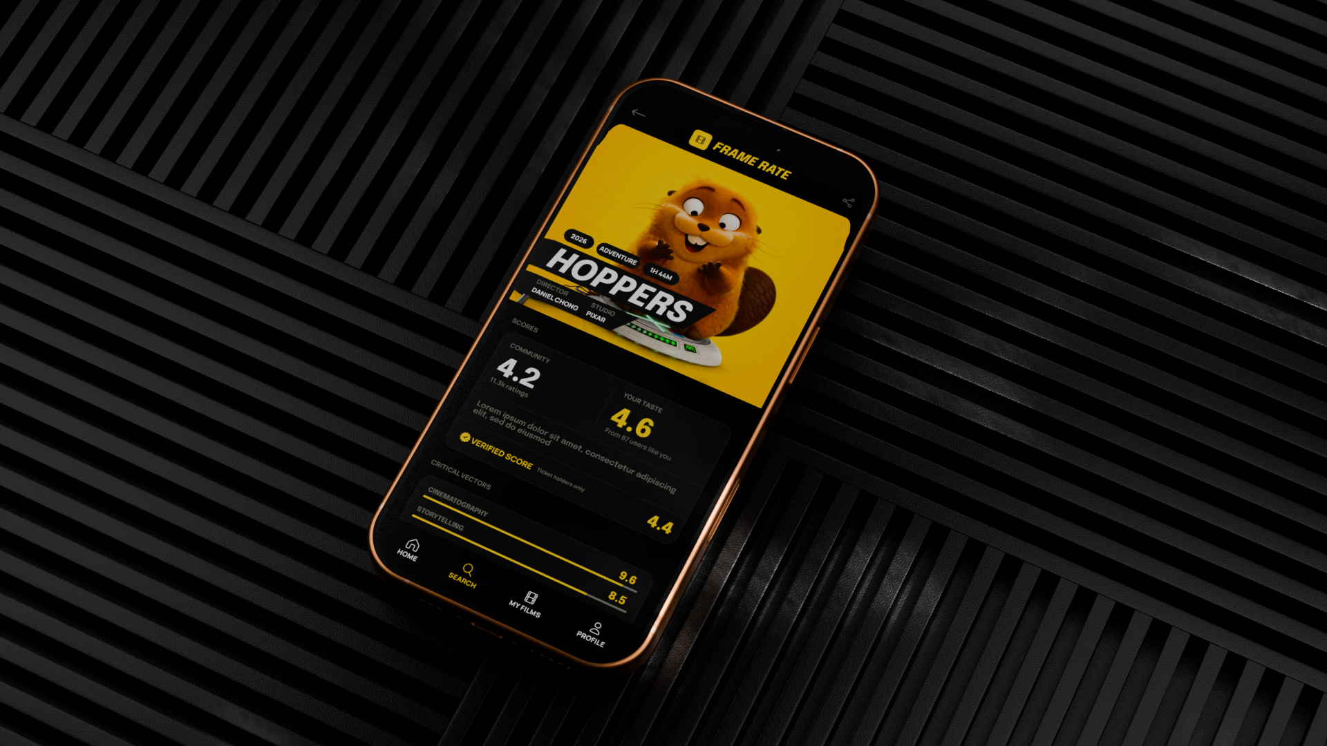
Two-Tier Score Visibility
The community score is always visible but in muted type. The verified score (ticket holders only) sits alongside it. The taste score is the hero: large, yellow, unlocked after watching. The gap between verified and unverified scores is itself meaningful data.
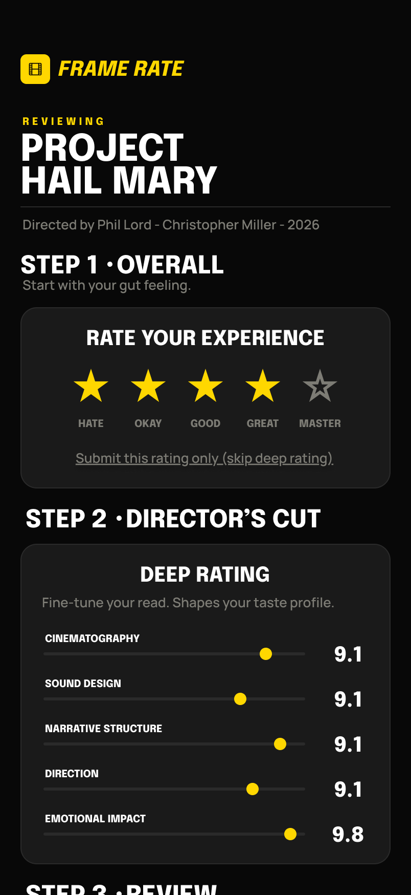
Taste-Matched Scoring
During onboarding, users rate five seed films to build a taste profile. Every score is then weighted toward people who rate films similarly. A 3.8 global score might show as 4.6 for someone whose taste profile aligns with the film's core audience.
Time Decay Scoring
A film's score is not a fixed number — it's a story. Frame Rate tracks how scores evolve from opening week through legacy status, mapping real-world events onto that timeline. Users can see why a score moved, not just that it did.
Showcase
Video
The full product showcase was produced end-to-end — 3D camera work, scene composition, and phone model in Blender, with animation and compositing in After Effects.
Every motion beat is tied to the product: score reveals, unlock transitions, and timeline animations reflect the actual app interactions they represent.
Logo
Reveal
The logo reveal was designed to communicate the app's core concept through motion — a film strip icon animating into the Frame Rate wordmark, using only black and yellow.
Yellow signals trust and personalization throughout the entire system. The logo reveal sets that tone before a single screen is shown.
The Ad — AI Voiceover
Motion · Sound design · AI voiceover — produced independently
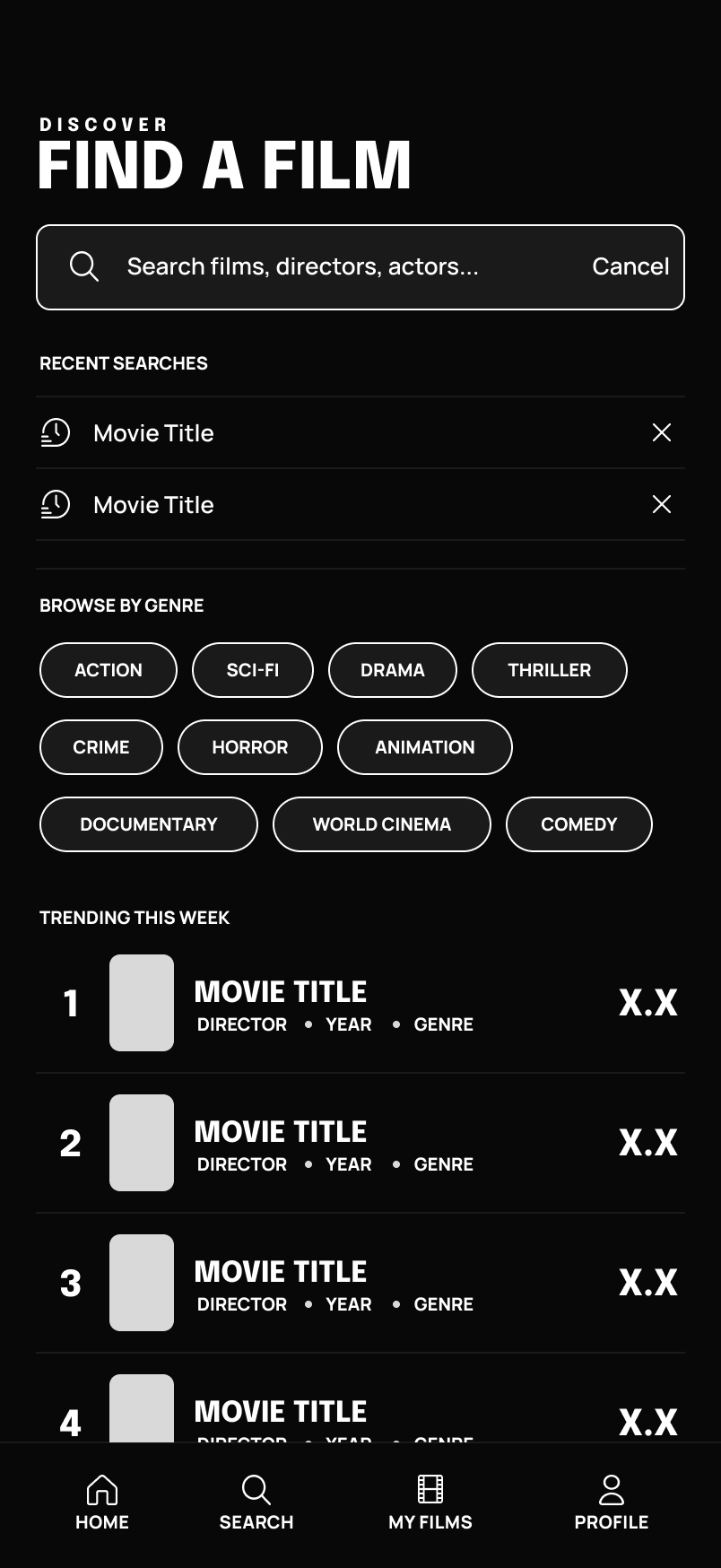
Wireframe to
Finished UI


Scene & Phone
Modeled by Me
Built in Blender · Rendered individually · Composited in After Effects
Color &
Typography
The visual identity centers on high-contrast dark backgrounds with a signature yellow that signals action, trust, and personalization. Epilogue and Manrope provide typographic clarity across data-dense screens.
Yellow is reserved as a system language — it means something specific on every screen. Taste scores, primary CTAs, and verified badges all share #FFD700, creating a consistent visual hierarchy without needing labels.
User Flow
Principled Design
Meets Usable Design
The biggest lesson: principled features and usable features are often in tension, and resolving that tension requires research rather than intuition. Seen-it gating as a concept is sound — but implementing it as a total score blackout was too aggressive. The two-tier model only emerged through testing the strict version and watching people bounce off it.
Frame Rate is a concept project. All screens, flows, motion, and 3D work were produced independently.
Work with me