Fifteen Seconds,
Three Flavours
Product Animation
& Flavour Transitions
From Key Visual
to Product Film
A motion design interview assignment: create a 15-second animation from the supplied campaign artwork, presenting all three flavours and the campaign message. The film needed to work in landscape and portrait layouts, with additional broadcast deliverables.
The supplied assets included the can model, packaging textures and campaign graphics. I developed the motion concept and handled the full production.
Giving the Spheres
a Purpose
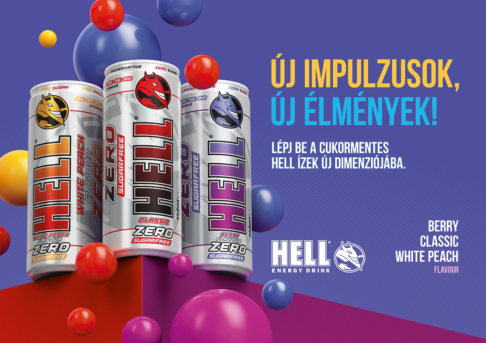
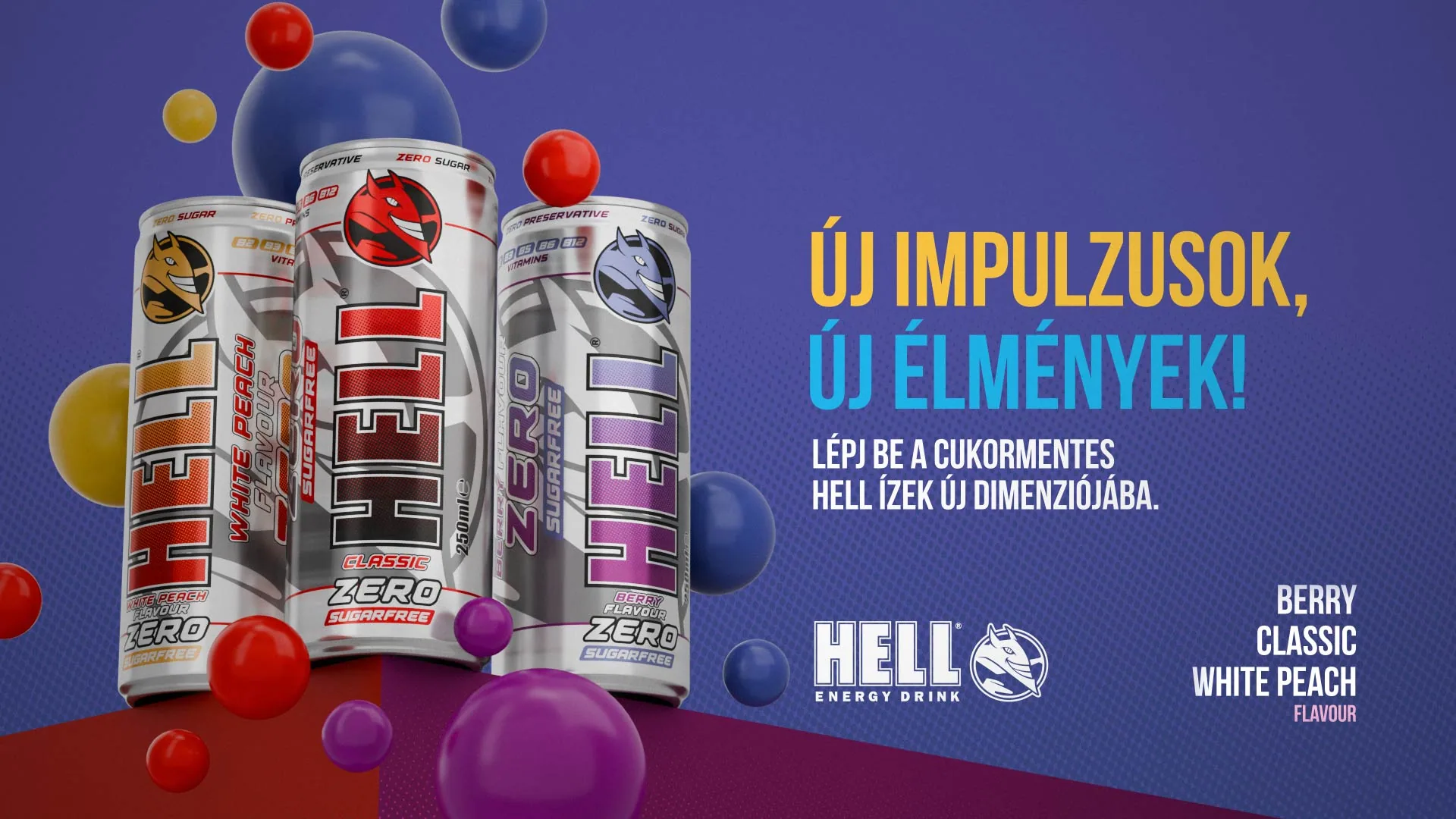
The coloured spheres in the original artwork became the starting point for the animation. Their colours already connected to the flavours, so I made each sphere trigger a transformation on impact.
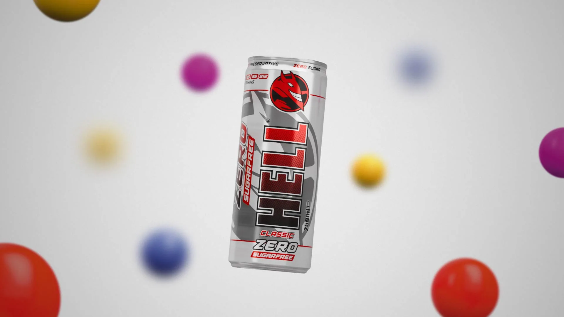
Introducing the flavours one at a time gives each variant a moment of attention before the final group shot. The floating setting allows the can to recoil and rotate, creating a contrast between gentle movement and fast impacts.
Building the
Final Frame First
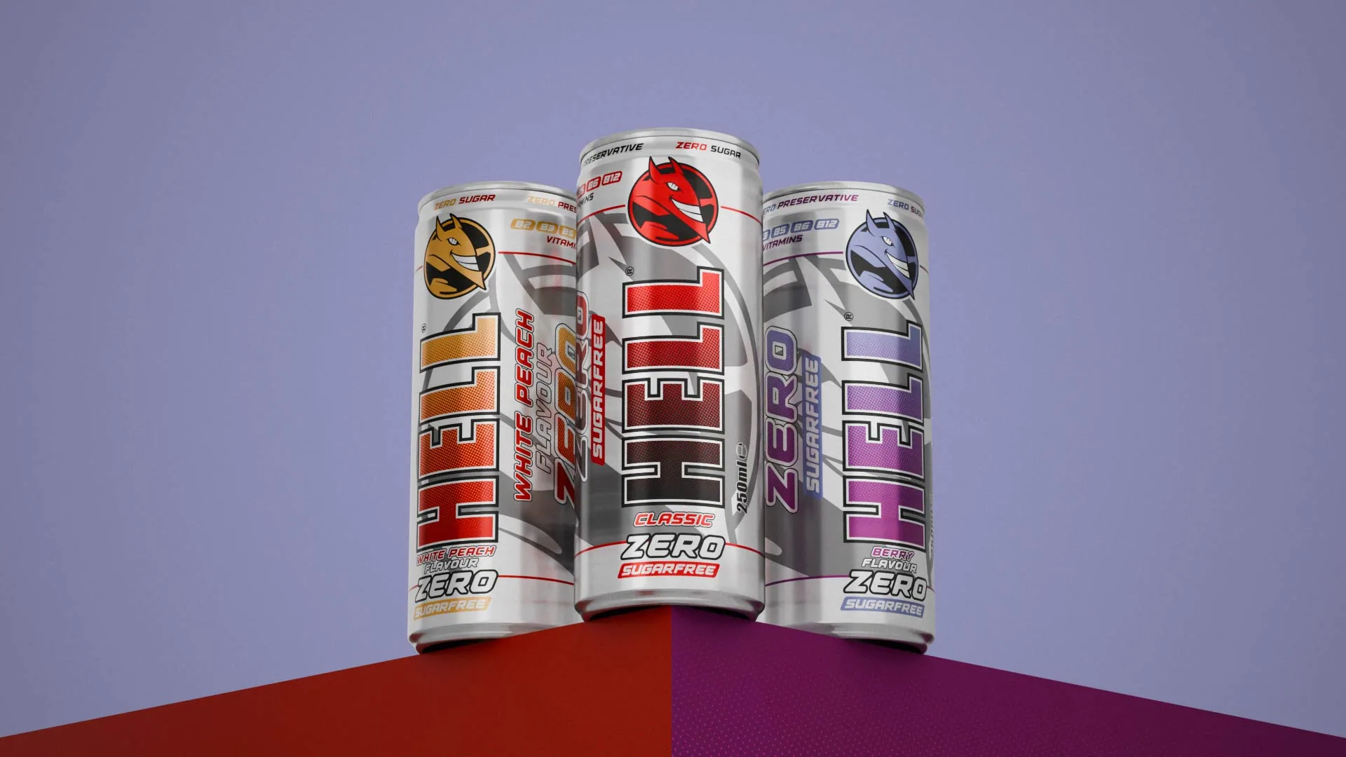
I began by recreating the campaign composition in 3D. Establishing the final frame gave me a visual target for the materials, lighting and sequence leading into it.
I developed the metallic can shading and glossy spheres around the supplied artwork, using its highlights and shadows as lighting references. Contrast, depth of field and controlled reflections helped keep the packaging readable.
Making the
Transformation Visible
The packaging differences were subtle — hiding the change behind a rotation would have wasted it.
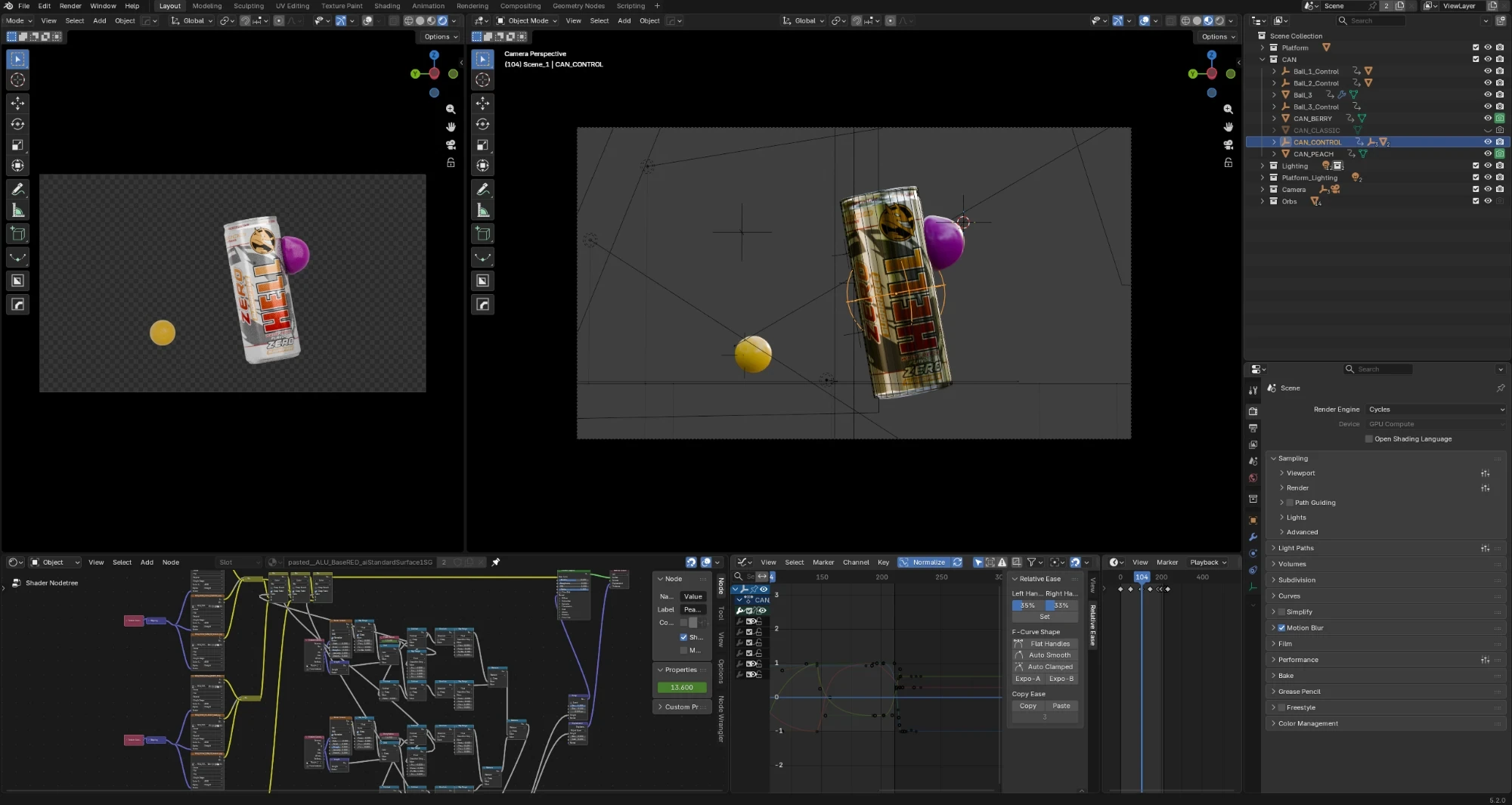
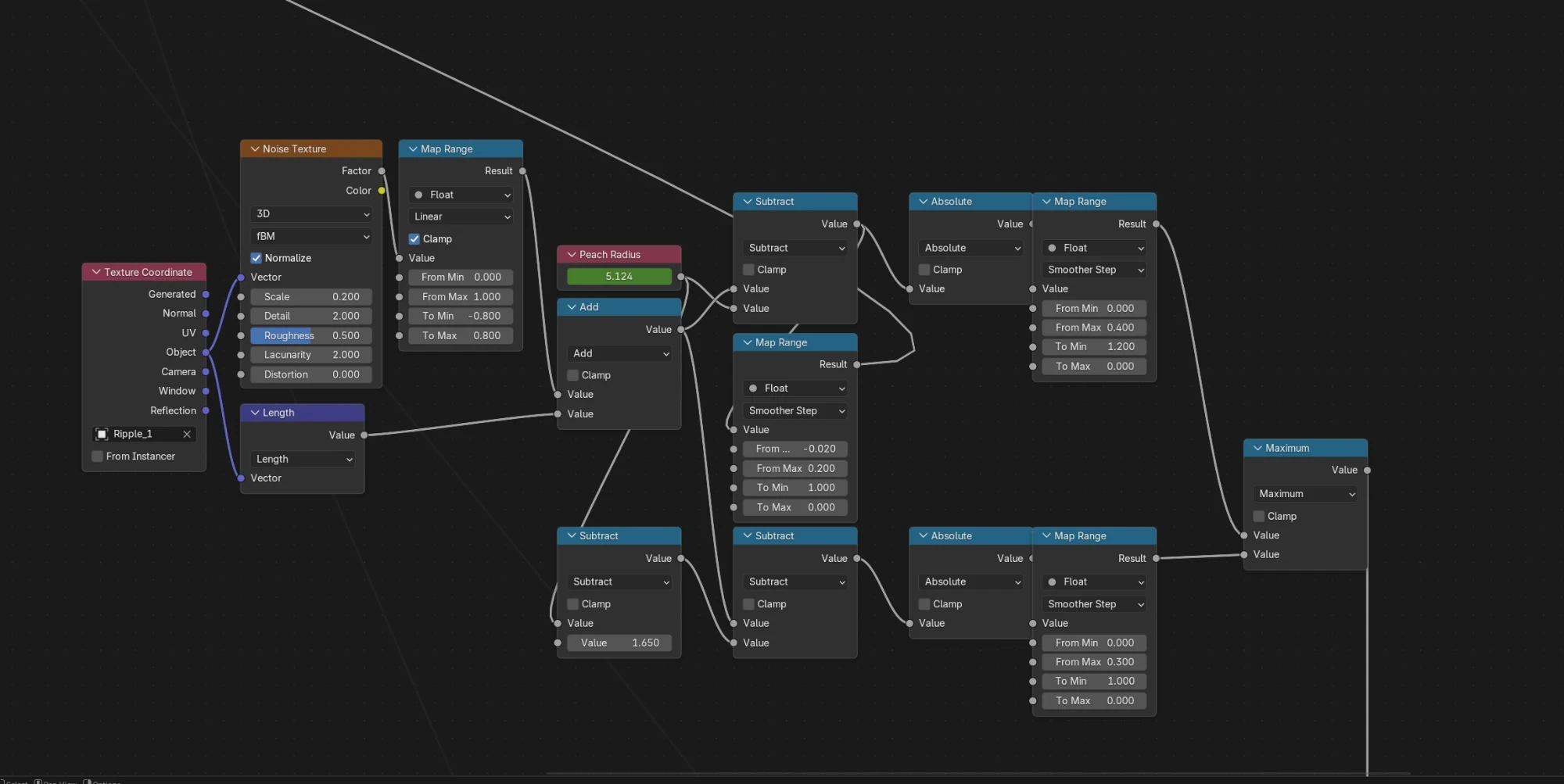
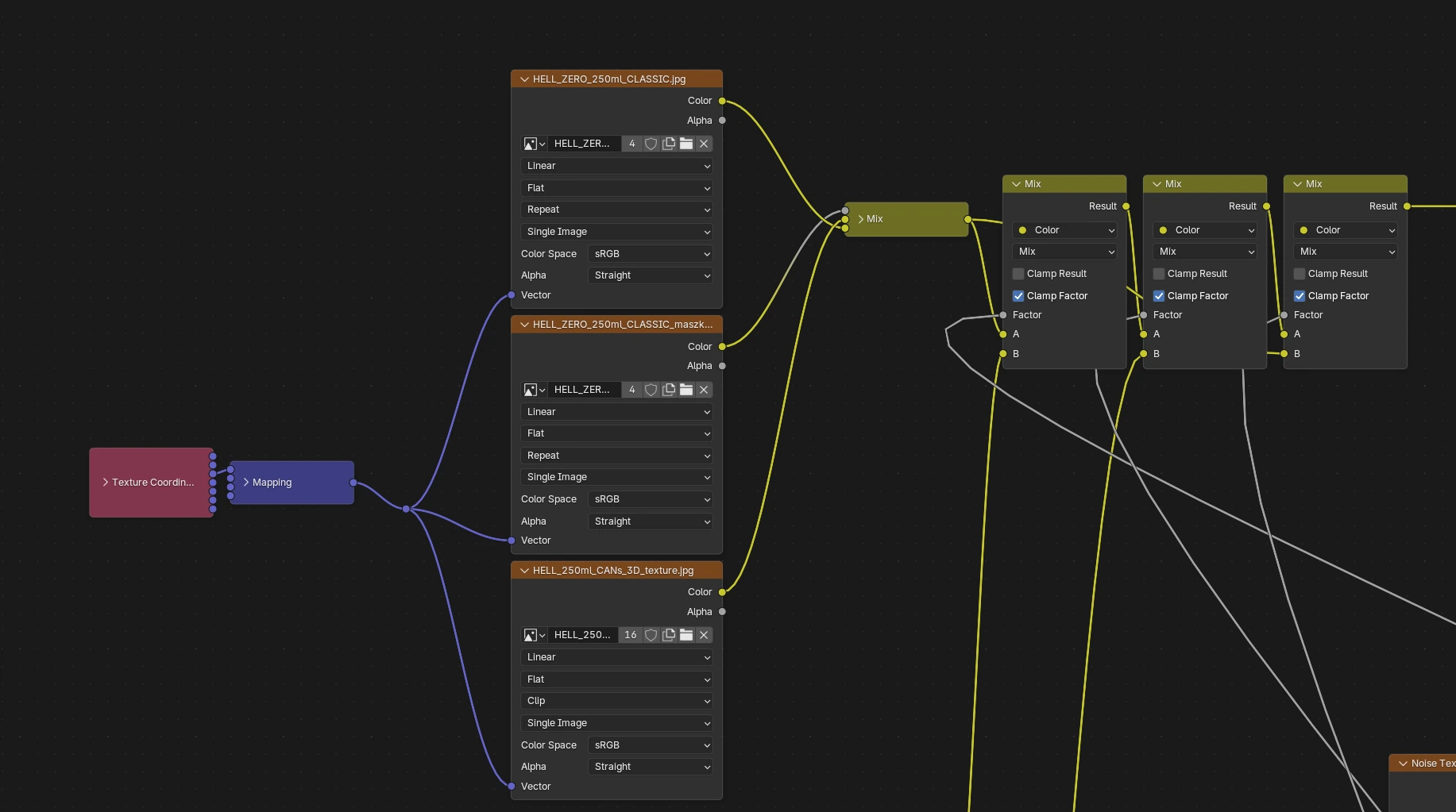
An expanding mask blends between the flavour textures, starting at the point of impact. An empty on the can drives the distance calculation; noise breaks up the edge, while bump and displacement create travelling ripples across the surface. Both effects share the same distance-based control, keeping the graphic reveal and the surface deformation aligned.
Balancing Simulation
and Control
I keyframed the spheres' paths and the can's reactions, then used soft-body simulation for the squash on contact. The challenge was balancing a rubber-like deformation with precise timing: the spheres needed to compress, retain their shape and separate from the can at the right moment.
The final transformation returns the can to Classic, maintaining continuity as it accelerates downward and becomes the first product to land.
Combining 3D and 2D
I used 3D for the spheres that interact with the can, and the supplied 2D assets for the background decoration. That kept scene complexity and render times down while retaining the campaign's visual elements.
In After Effects I integrated the layers through colour correction, depth cues and motion blur. Cryptomatte passes gave me isolated control over the interacting spheres, bringing their colours closer to the supplied artwork.
Sound and Pacing
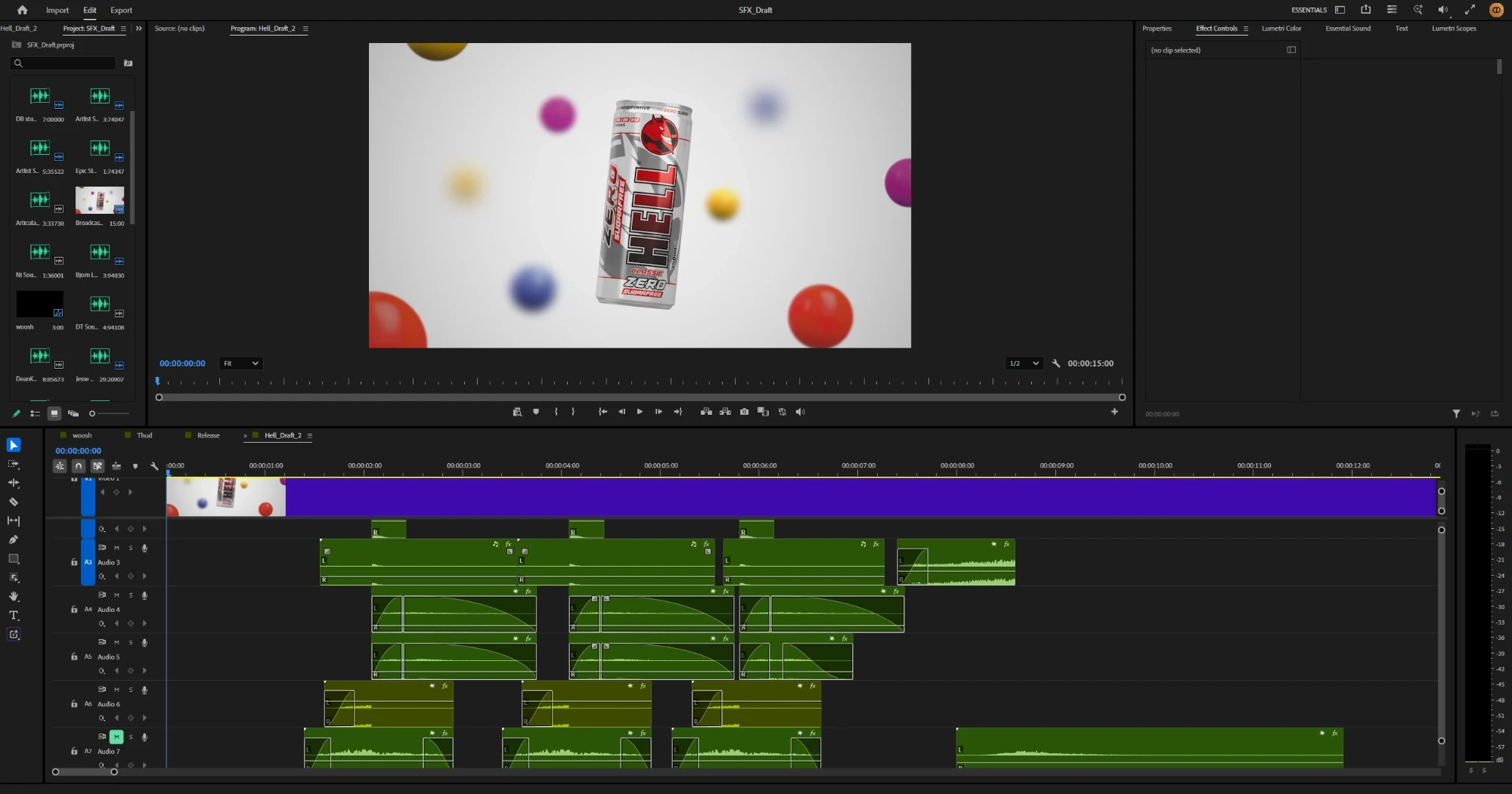
The sound follows the shift from weightless motion to a more energetic landing sequence. An airy synth and choir-like texture supports the opening, with watery effects accompanying the transformations. Percussive electronic elements bring weight to the final arrivals.
I selected, edited and mixed the sound in Premiere Pro using Artlist assets.
Adapting the Composition
I adjusted the layout for portrait delivery, repositioning the products and typography to maintain hierarchy within the narrower frame and respect platform safe zones.
Delivery included social MP4s alongside broadcast MOV and MXF versions, prepared to a Bulgarian Adstream specification with Lumetri scope checks, timecode and loudness normalisation.
Colour Doing
the Work
The colour-driven transitions give the existing campaign elements a clear role in the animation. Combining 3D interactions with 2D background elements also helped me complete the piece within the production window.
With more time I would refine the landings and settling motion, and strengthen the sound transition into the final sequence. On a similar project I would test motion against a temporary soundtrack earlier, to develop the visual and audio rhythm together.
Independent interview assignment based on supplied HELL Zero campaign assets.